Bitwarden
Import, without the guesswork
A zero-to-one overhaul of Bitwarden's import experience, so 15 million users never have to wonder if it worked.
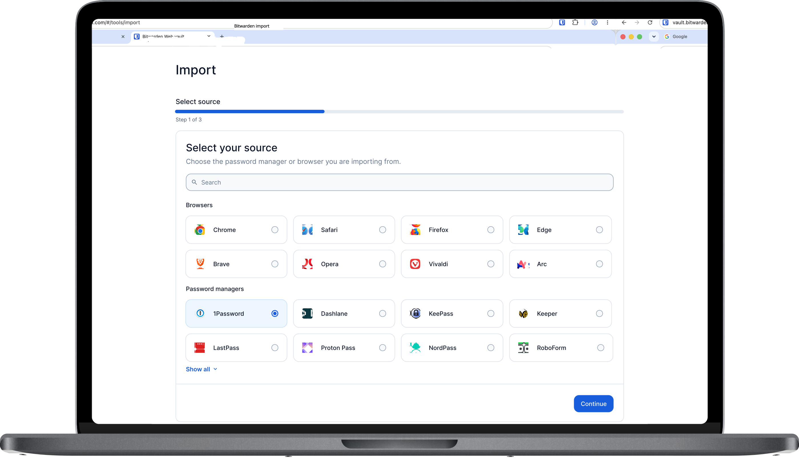
Vision
Rebuild a fragmented foundation
Since joining Bitwarden, import accumulated a handful of additive changes, each solving an immediate need, but gradually layering complexity onto a system that wasn't designed to grow. What should be a high-stakes opportunity for Bitwarden to build trust had become an experience that felt fragmented and unpolished.
I took initiative and evaluated the entire migration experience: where users were losing confidence, what problems take highest priority, and how we could measure whether our changes moved the needle.
This project was more than a visual refresh. It was a zero-to-one overhaul with a vision of turning an increasingly complex experience into a scalable foundation, one that would build trust today while giving the feature room to evolve as the product grows.
Understanding the landscape
Trust broke down early
Before deciding what to change, I needed to understand how import worked—and felt—across Bitwarden today.
I mapped the end-to-end experience across mobile, desktop, and web, anchoring on two users at opposite ends of the spectrum: an organization user who may be required to use Bitwarden, and a power user actively choosing to migrate. Their motivations and expectations differed, but both exposed the same underlying gaps.
Across platforms, four recurring areas of friction emerged:
Inconsistent entry points
made import harder to find depending on the platform.
Unclear product copy
left users uncertain about what to expect.
Technical errors without resolution
told users something went wrong, but not how to fix it.
A lack of post-import guidance
left users unsure what to do once the import was complete.
I also worked closely with my engineering counterpart to understand technical constraints early — which formats and edge cases were feasible to support, and where platform-specific limitations were shaping (or distorting) the experience. Grounding the research in what was actually buildable meant I could prioritize problems worth solving, not just ones worth naming.

Inconsistent entry points. The product lacked parity between platforms making import harder to find.

Unclear product copy. Callouts and product labels were inconsistent with industry standards leaving users uncertain about what to expect.

Technical errors without resolution. Technical errors told users something went wrong, but not how to fix it.

A lack of post-import guidance. Left users unsure what to do once the import was complete.
Then, I listened to our users.
Bitwarden's open-source model gives us an unusually rich body of feedback to learn from. I looked across community forums, Reddit, pull requests, contact form submissions, and Jira tickets to understand where people were getting stuck, what they were worried about, and what they expected from the migration experience.
With Claude's help, I scraped and synthesized this qualitative feedback to surface recurring themes and prioritize where to investigate further. Three anxieties came up again and again:
Fear of duplicates
Users worried that re-importing would clutter their vault with duplicate credentials.
Confusion when imports fail
Technical or unclear error messages left users unsure what went wrong or how to fix it.
Uncertainty about completeness
Users had no clear confirmation that all of their credentials had successfully transferred.
Finally, I looked beyond Bitwarden.
I audited competing password managers to see how other products handled the moments where user confidence tends to break down, focusing on four areas: discovery and access, formats supported, data handling, and post-import experience.
The pattern was consistent: the market optimizes for speed — getting users through import as fast as possible — at the expense of the moments after. Almost none of the products I reviewed addressed duplicate handling early enough to guarantee a clean import; instead, cleanup was pushed downstream onto the user. Few experiences helped people understand what was happening mid-import, recover gracefully when something failed, or verify with confidence that they were actually done.
Defining the opportunity
Fast wasn't the point
With a view of our current experience, direct user feedback, and the competitive landscape, I synthesized what I had learned into a SWOT analysis.
The opportunity became clear: Import didn't just need to be faster. It needed to make migration feel trustworthy. That became the lens I used to evaluate potential solutions.
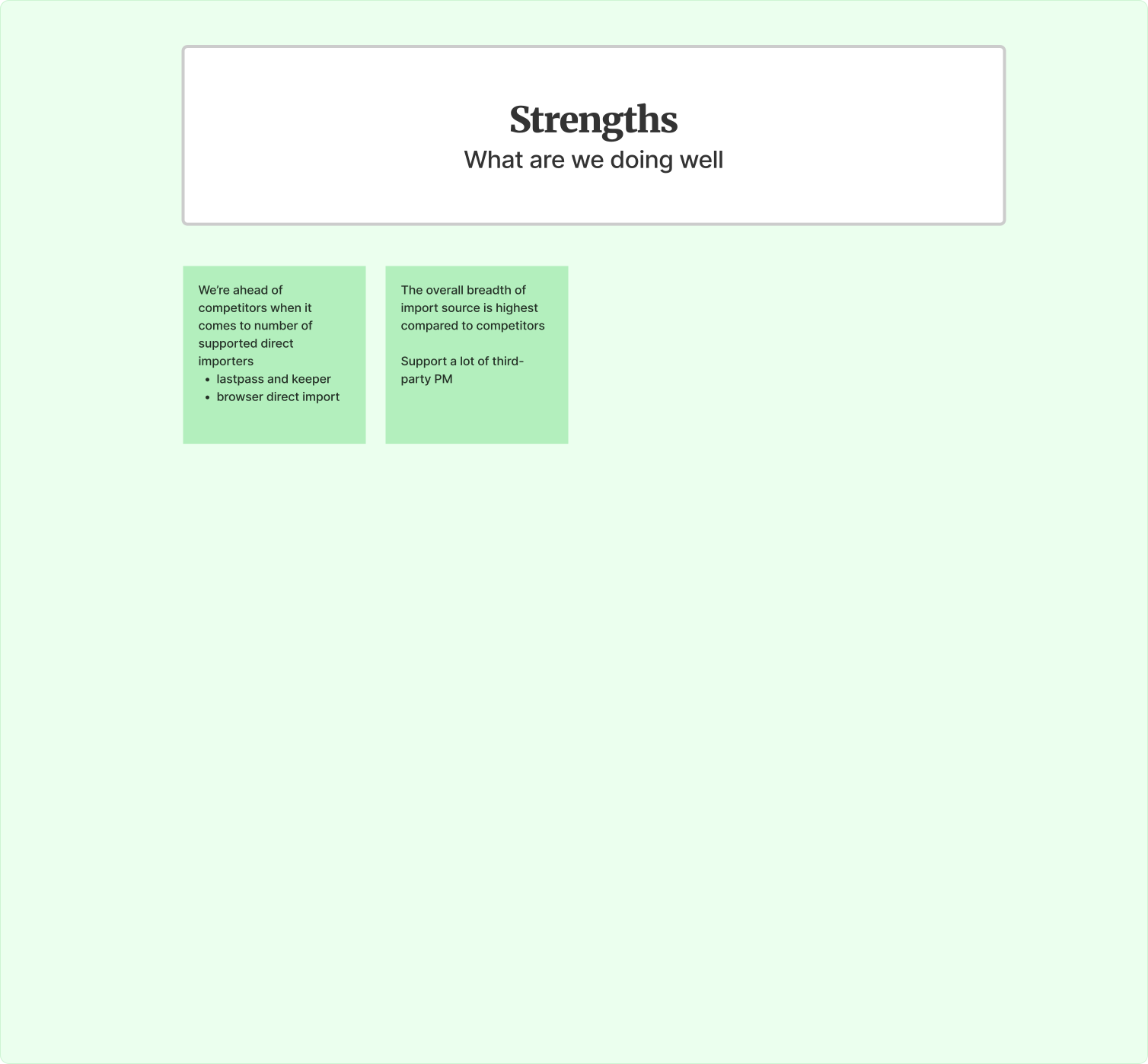
Strengths. Bitwarden has the highest number of direct importers and supports the largest number of file imports.
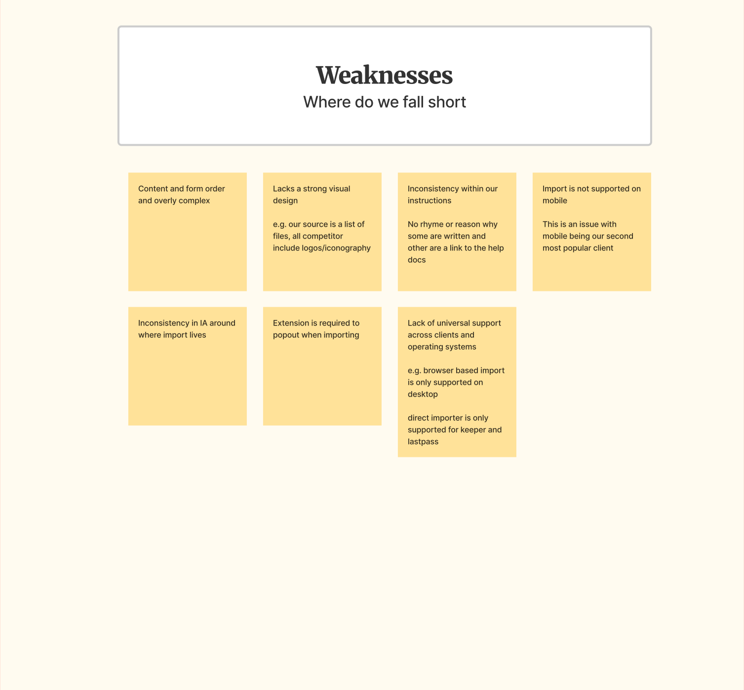
Weaknesses. The feature is an overly complex form with lacking visual design.
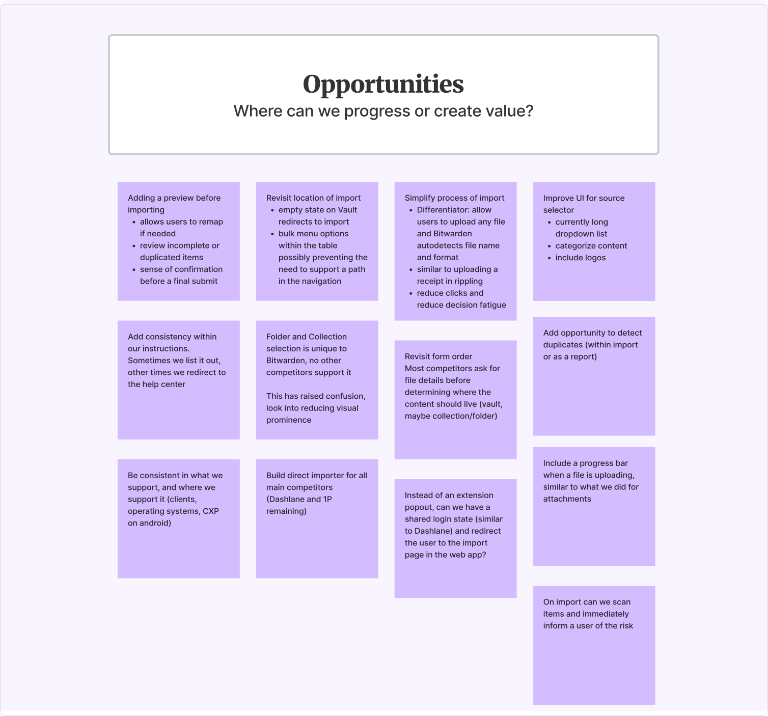
Opportunities. Opportunities include detecting duplicates, updating the IA, building consistency across clients, and more.
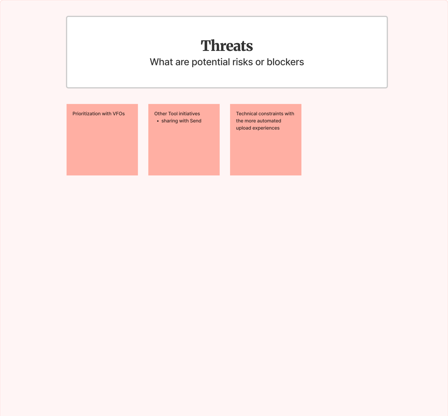
Threats. Some threats or risks include deprioritization against VFO work and technical constraints with a more automated experience.
Exploring the solutions
Turning the opportunity into ideas
With the opportunity defined, I explored how we could make import feel more seamless while giving users more confidence and control.
Usability testing
Simplicity had its limits
To meet our timeline while reaching a broader range of users, we opted for unmoderated usability testing with 50 participants. We tested key moments across the experience, including preferred import method, resolving duplicates, and confidence in the outcome of an import.
25
Recent users — Accurate comparison against current experience
25
Non-Bitwarden users — To reduce bias
50
Users — Total
Direct import was immediately intuitive.
The core import experience performed strongly across both groups, with 96% task success and no failures. Users quickly understood the direct importer and how to use it.
The more complex decisions needed refinement.
Duplicate resolution showed us that simplicity had its limits. Users wanted more information and control before committing to merging items—they needed to understand what would happen before making an irreversible choice.
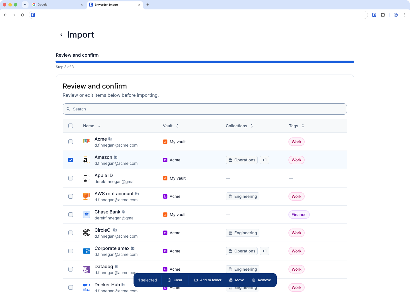
We saw a similar pattern with vault assignment. The majority of users looked to the overflow menu or checkboxes to modify preview data rather than discovering the inline editor we had designed. That prompted us to go back to the drawing board and reconsider whether inline editing was the right solution to introduce at this stage.
The experience met or exceeded expectations.
98% of new-to-password-manager users and 92% of password manager users said the experience met or exceeded their expectations.
These results gave us confidence in the overall direction while highlighting where another round of iteration was needed. I took what we learned from duplicate resolution and vault assignment back into the designs and tested those improvements again.
Refining the experience
The first solution is not the final
Testing showed us where the experience needed more clarity, control, or familiarity. We took those findings back into the designs and iterated on the moments that mattered most.
Giving important actions more hierarchy
Before → After
 BeforeAfter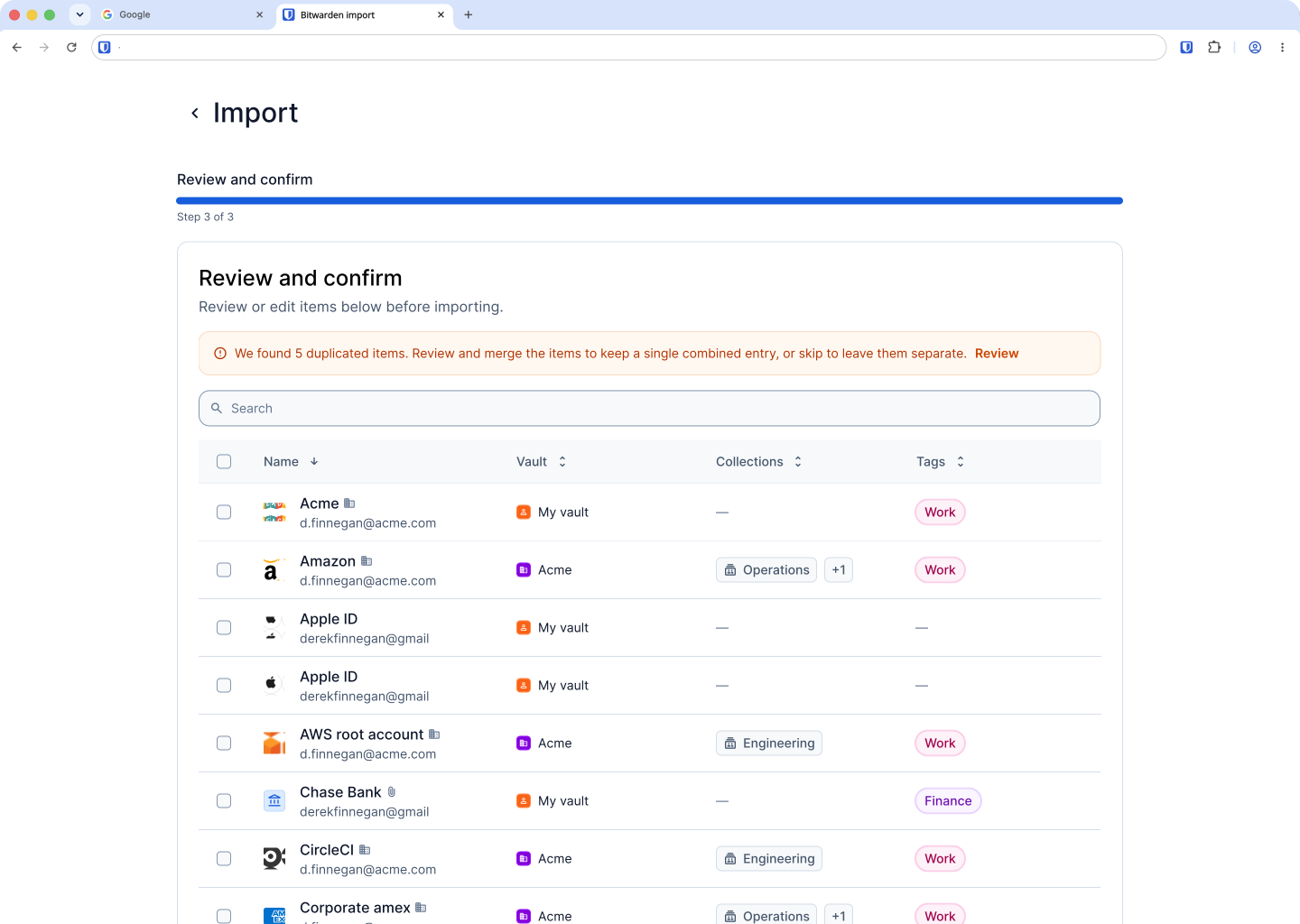
88% of users noticed the callout prompting them to review duplicates, but some overlooked the text button that took them there. We gave the action more visual hierarchy by replacing the text button with a standard button, making the Review step more prominent and easier to discover.
Giving users more control over duplicates
Before → After
 BeforeAfter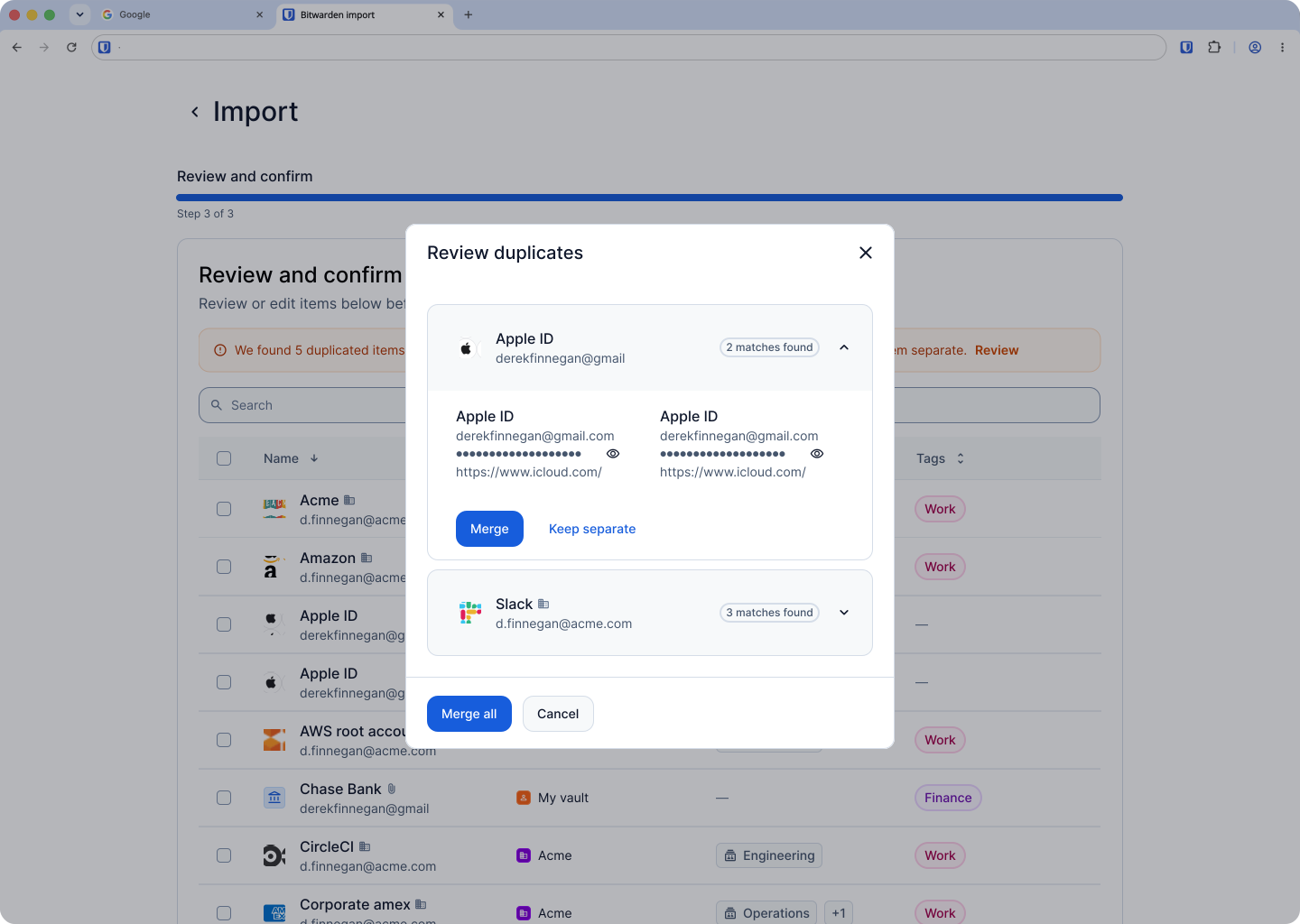
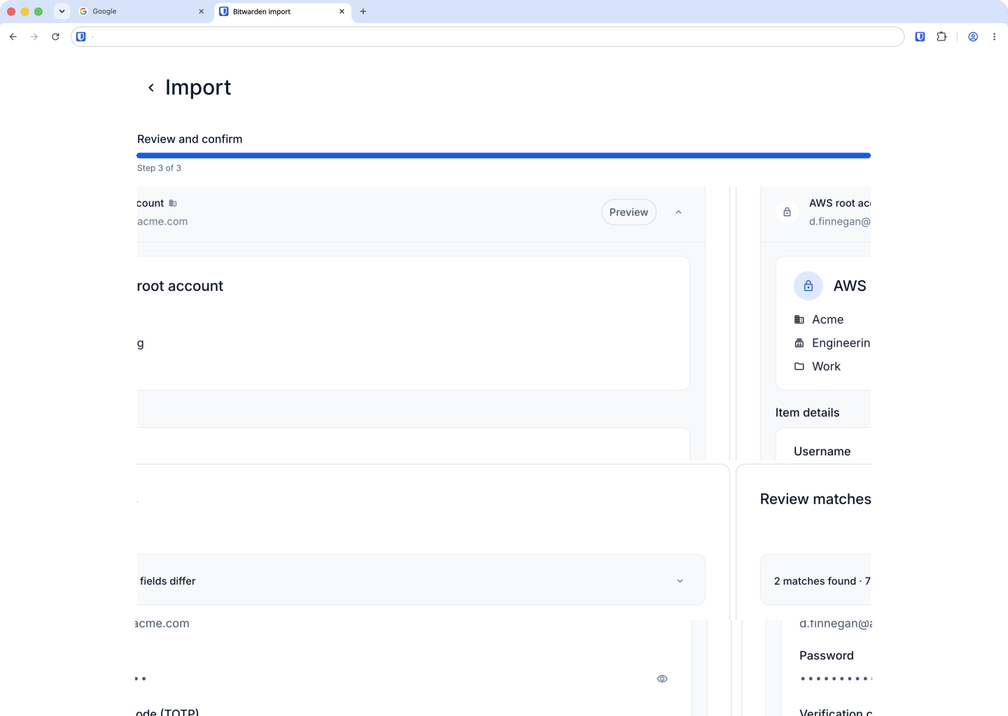
We expanded the duplicate resolution experience with more information to help users make an informed decision, including when each item was last modified. We also added the ability to select a specific version to keep. Previously, users could only merge items or keep all variations, which didn't give them enough control over the outcome.
Returning to familiar interactions
Before → After
 BeforeAfter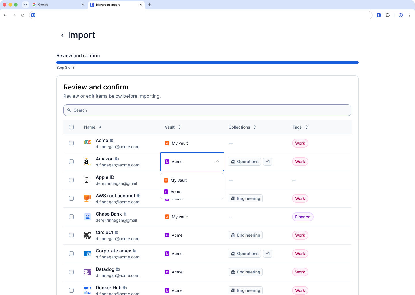
Testing showed that users naturally looked for familiar controls to edit their preview data, with most navigating to the checkbox or overflow menu rather than discovering the inline editor. We reverted to these existing interactions, prioritizing familiarity and discoverability over introducing a new editing pattern.
Solution
A migration experience users could trust.
The full vision addressed friction across the migration journey, but delivering everything at once wasn't the only way to create value.
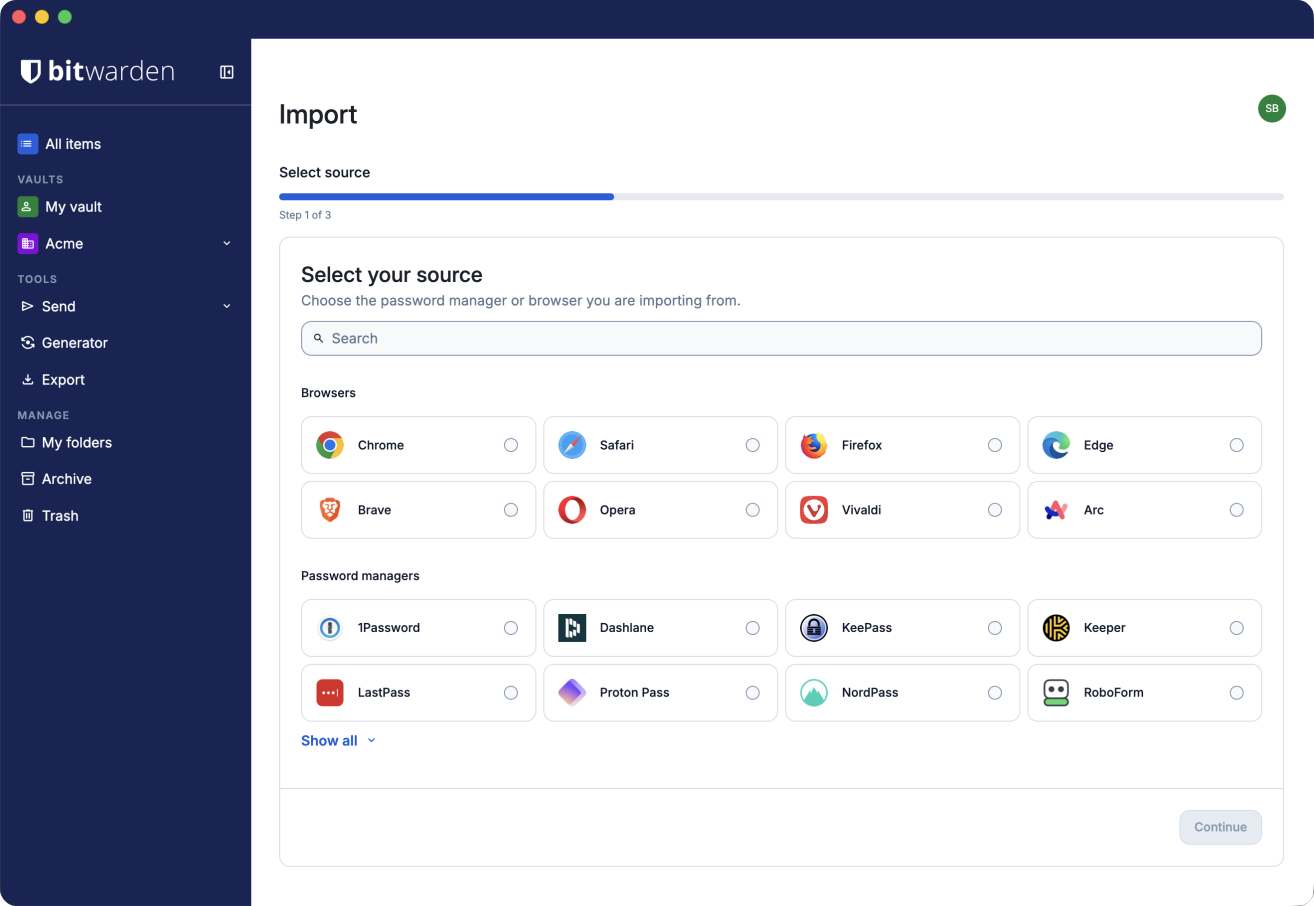
I worked closely with engineering to understand technical dependencies and determine how we could phase the work. Together, we identified the highest-impact improvements we could ship sooner while keeping them aligned with the broader experience.
That meant asking:
- What can we improve for customers now?
- What technical dependencies need to be solved first?
- Which improvements can stand on their own without creating a fragmented experience?
- How do we build toward the larger vision without compromising what we ship today?
The result was a phased approach that balanced customer impact, technical feasibility, and experience cohesion—allowing us to deliver meaningful improvements sooner while building toward the larger migration experience.
 BeforeAfter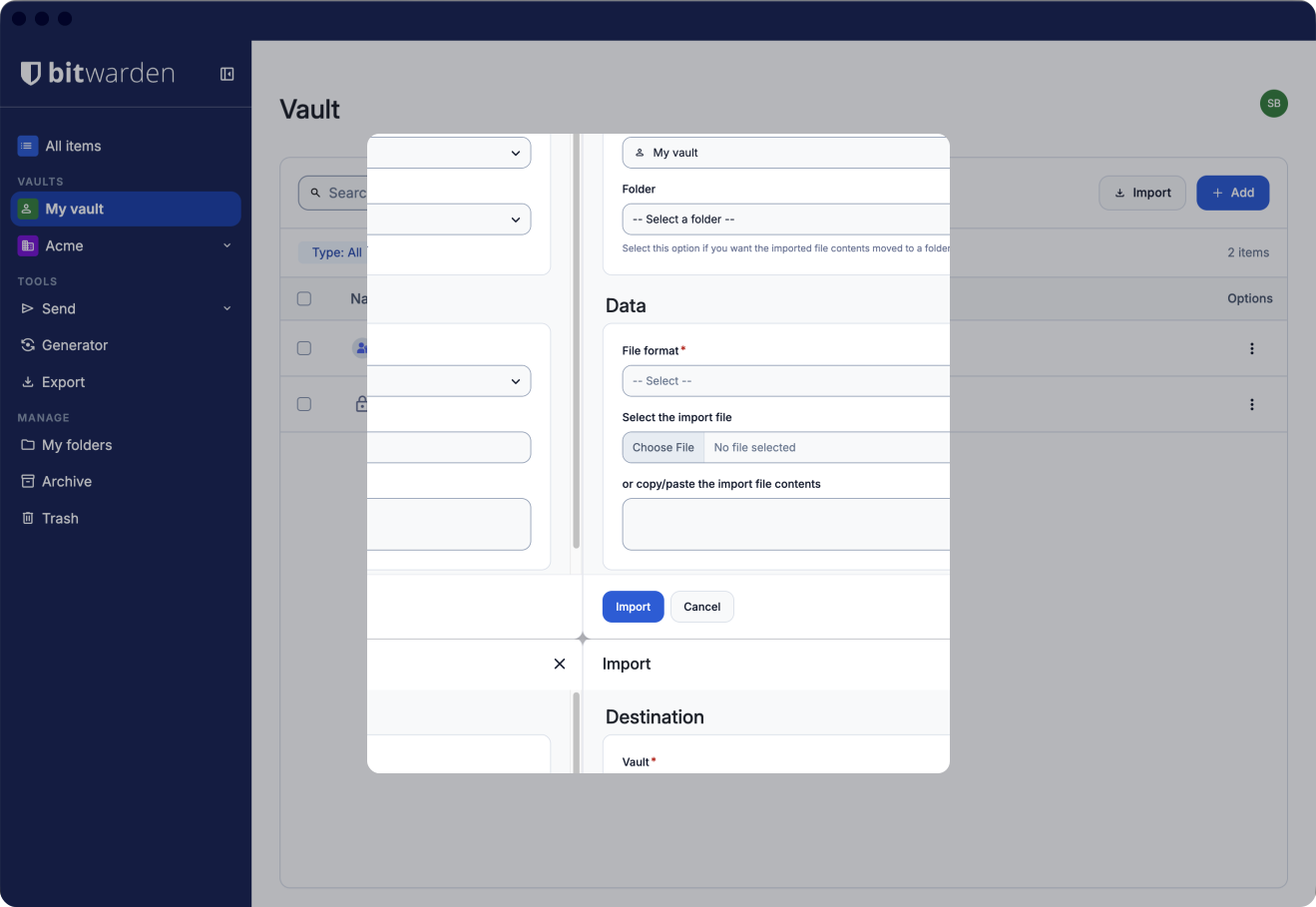
Results
A clearer path from migration to everyday use
The redesign created a simpler, more guided migration experience and reduced uncertainty at the moments that mattered most.
50% faster
Import completion in usability testing
3 fewer steps
In the standard browser migration flow
Metric coming soon
Description of your strongest additional result
Beyond the measured improvements, early qualitative signals pointed to a clearer migration path. Users reported less confusion at the import step, while support conversations increasingly focused on next steps rather than whether data was lost.
Note: Production metrics and detailed outcomes are still being expanded for this case study.
Reflection
The clearest path isn't always the simplest one.
This project challenged one of my assumptions about good product design: that reducing complexity always creates a better experience.
For migration, that isn't necessarily true. When the stakes are high, users sometimes need more information and more control, not fewer decisions. Testing helped us distinguish between complexity that created friction and complexity that gave users confidence.
It also reinforced the value of designing with the broader system in mind. Rather than treating import as a collection of screens to optimize, I had to consider how the experience could scale, how engineering could phase the work, and which patterns were worth introducing versus building on what users already knew.
The result wasn't the fewest steps possible. It was a more intentional path—one that gave users enough clarity and control to move forward with confidence.
Next steps
Import was the first opportunity to surface a broader vault-health problem: duplicates can signal that a vault needs attention, but that insight shouldn't disappear once migration is complete.
A future direction would evolve the duplication experience into a vault health report, giving users a persistent place to review duplicates and other items that may need attention across clients. Import could serve as the first signal, introducing users to these insights at a moment when they're already evaluating the state of their vault, while the report gives them a way to return to them over time.
This shifts duplication from a one-time migration concern into an ongoing capability for helping users understand and maintain confidence in the health of their vault.